Bar chart
Overview
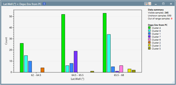
The Bar chart artefact allows the graphical display of contingency tables, showing the relationship between the number of samples in two properties (multi-variate frequency distribution)
Version: p:IGI+ 2.5+ (Sep 2024)
Usage: Statistics --> Bar chart...
How to use in practice

The colour and shape palettes are used to define the two groupings, so both discrete and binned continuous properties can be used and the interaction with palette show/hide entries provides flexible control over the classes / bins shown. Sample sets can also be applied to filter the data.
The y-axis maximum can be configured if desired to provide comparisons, the user can show counts or percentages on the y-axis and horizontal grid lines can be shown / hidden.

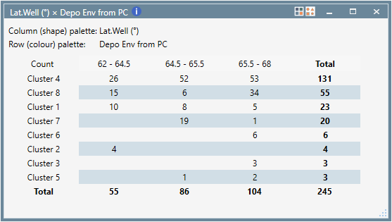
A tabular view can be selected in the artefact, or on a dashboard and the table styling for this view can be customised and remembered. A data summary can be added either above, to the right or below to enable flexible use in dashboards.
The chart can be copied as an image, with or without the legends. The legends can be copied individually and if the tabular view is copied, a text table is put on the clipboard.
© 2026 Integrated Geochemical Interpretation Ltd. All rights reserved.