Using Maps
Overview
Although not a specialised mapping package we have added the ability for the user to explore their data spatially along with contextual geospatial vector data in the form of Shapefiles.
Version: 2.3+ (Sept 2023)
Usage: Map --> New map...
How to use in practice
The maps have their own menu item, and can also be created from the toolbar icon or the menu (Map-->New Map). The user can create as many map views as they like within a project, and can customise what is shown on each one. The right-click Clone option allows you to create and modify copies of existing maps. Like all other artefacts, maps can be saved as templates and shared between projects, although the shapefiles will not be included, and are only linked to a specific (potentially shared) folder location.
Maps
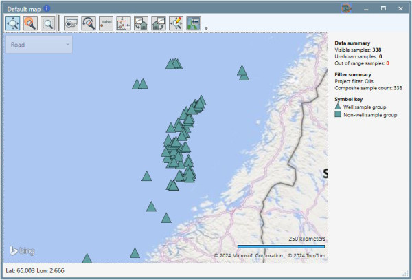
Maps provide an integrated spatial visualisation of your data. The base maps are provided by Microsoft Bings maps (and thus require an internet connection to display - the maps will still function without this, but will not show base mapping). The maps assume any lat / lon data provided is in the WGS84 geoid (we do not currently convert from other geoids e.g. ED50, but the location differences will be small for the spatial scales relevant to geochemistry). The Bing map background supports four styles, which can be changed from the dropdown menu in the top left of the map display. We provide a plain white background option to allow you to provide your own base mapping as Shapefiles, if you prefer this.
When first created the maps default to a full world view, to ensure you do not miss any relevant data, and can see the full context of your data, but you can readily zoom to your data extent using the toolbar just above the map (fifth icon from the left). Maps will subsequently remember the view selected. From v2.5 maps are now constrained to -180 to +180 degrees longitude, this means the user can only ever see one ‘world’ at a time, and ensures the data summary will always give the correct count of the number of samples and users can use the new rectangle zoom tool to zoom on a map.
Maps and your data
By default the maps show the sites in the project which have data, with a triangle denoting a well site, and a square denoting a non-well site (e.g. an outcrop or seep sample, or set of samples). The size of the symbol can be set in the Map Settings dialogue, as well as the default window opening size. From v2.5 the map size can be set like graphs to allow users to copy identically sized maps from the Edit settings... dialog.
Maps are fully integrated with the other artefacts, and like graphs can have sample sets applied to them to restrict the data shown, for example applying a sample set of samples from the Jurassic period would show the spatial distribution of data within that period.
Brushing
You can brush your sites on a map (brushing is accessed using the brushing icon on the map toolbar or the Ctrl+B keyboard shortcut). Brushing a site will select all samples in that site. Brushing points on a graph will highlight the site(s) on the map. Visual query can also be used and will highlight the spatial location of the selected sample on the map.
Working with palettes
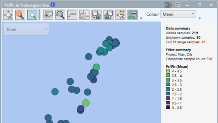
Applying a discrete colour palette (based on text data) to a map will show a disc that illustrates the presence of the different categories at the sites (Occupancy) - this can be useful to show the presence or absence of different e.g. oil families, or stratigraphic horizons. You can select to change the display mode of the discs to Frequency which will construct mini pie charts at each site showing the proportion of data in each palette class at each site. What is shown will respect the sample set applied.
Applying a continuous colour and / or size palette (based on numeric data) will by default show the mean of the property selected at each site. The user can select to show a range of statistics (the mean, standard deviation, 10th percentile, 50th percentile (median), 90th percentile, the interquartile range, the minimum or the maximum value). This allows you to visualise the spatial variation of properties at the sites, and when used in conjunction with sample sets allow you to look at the spatial variation within, for example a stratigraphic horizon.
Discrete colour and continuous size palettes can be mixed as shown above.
Since the variation in the means (or other statistics) might be less than the variation in the individual samples you may need to create specific palettes to show the variation in the statistics appropriately.
It can be helpful to clone a map artefact, and show side by side for example the mean and standard deviation to show both the average trends but also bear in mind the variability within that trend. Or to compare the P10 to P90 values side by side, in a horizon.
Shapefiles
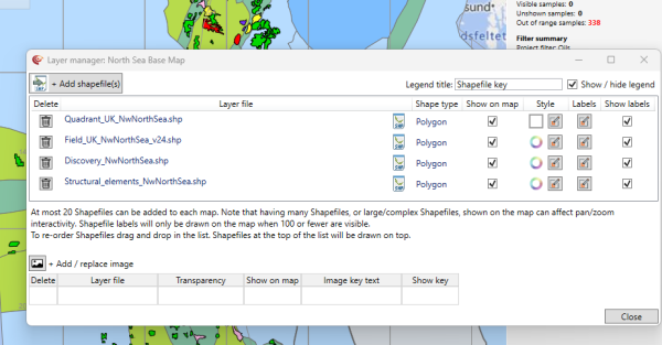
Shapefiles can be applied to a map providing geospatial context to a map. This is especially helpful when wells are located offshore. Currently:
- Individual Shapefile size is limited to 10Mb.
- A maximum of 20 shapefiles (from version 2.0) can be imported to a given map as large numbers of Shapefiles will slow mapping performance, especially when using pan and zoom on the map.
- Shapefiles are not stored when the project is saved, the link is saved, so the Shapefiles will display as long as the files are not moved from the linked location.
- The Shapefiles must include: the .shp file, the index file .shx and a database .dbf file in the source folder.
- The Shapefile must be in a WGS84 lat/lon projection. From v2.5 where possible we will convert the coordinate system of shapefiles to the correct WGS84 Lat/Long projection when reading. It is no longer necessary to use a GIS system to convert shapefiles to WGS84 Lat/Long for use in p:IGI+. They also will read UTF-8 encoded field values and will support geometries which include a ‘Z coordinate’.
Shapefiles are managed using the Layer manager, which is the right-most icon on the map toolbar. This allows you to link to Shapefiles, and define their visual appearance. From version 2.3 the user can colour individual elements in shapefiles based in the value of a selected element in the database by using the Edit shapefile style button and then selecting an attribute. From v2.5 the zoom to data, label points, and open layer manager have been added as a right click option.
From v2.5 the toolbar can be hidden on the map, as can the lat/long position which can be especially useful on dashboards.
You can drag and drop shapefiles in the editor to reorder them, allowing control of which shapefile is drawn on top of the others. The data is always drawn on top of the shapefiles.
Images can be added as an underlay on the map using the Add/replace image button which registers the image similarly to graphs. Once the image has been defined by its coordinates the user can set the images transparency and add image text to the legend. The image link is remembered as part of the map so will remain shown as long as the path remains valid.
Data point labelling on maps (version 2.0+)
Selecting the 'Label' icon on the map toolbar will bring up the data point labelling dialogue:

This allows you to select a text or numeric property with which to label the sites.
Selecting a text property will create a label that contains a list of strings present in the data (remember there are likely to be multiple samples at a given location) at that location. The list is ordered by frequency and elements are separated by commas.
Selecting a numeric property will label the data with mean value +/- the standard deviation with the number of samples used to calculate the statistics provide in brackets to provide a sense of the reliability of the statistics. The values are presented in the selected units of measure, and the user can select the precision (in terms of decimal places) to show.
The user can select which locations to label using brushing (Crtl+B to change to brushing mode, Ctrl+L to clear the brushed set). A legend is added to the map to inform viewers of the property used in labelling, including the units.
The font size used in the data labels is shared with graphs, and set in the Graph Settings, Fonts tab.
Influence of system culture
The map view respects the culture / region settings on the computer. You will need to correctly set the Windows Display Language to your locale - it seems using the English (United States) prevents the use of metric units. However when using English (United Kingdom), it is then possible to set the "Measurement system" to Metric (km shown) or U.S. (miles shown). This is set from the "Region" settings dialogue in windows, on the "Advanced settings..." button.
From v2.5 the zoom to data, label points, and open layer manager have been added as a right click option.
Information summary
From v2.5 the data filter and project summary can be shown on the maps and the position can be set to top, right and bottom.
© 2025 Integrated Geochemical Interpretation Ltd. All rights reserved.